
Making it easy for people to pay you is pretty important, right? If the payment part of your website or app is a hassle, people might just leave before they buy anything. We’re talking about the payment method page design here. It’s all about making that final step as smooth as possible. Let’s look at how to get that right.
Key Takeaways
- Keep the payment process short and sweet. Ask for only what you absolutely need.
- Give people choices for how they pay, including popular options like digital wallets and ‘buy now, pay later’ services.
- Make sure your payment page works well on phones. People often pay using their mobile devices.
- Process payments quickly and handle any errors or declines without causing too much trouble for the customer.
- Clearly show what the customer is paying for and what their payment options are. Make it easy to understand.
Simplify The Payment Flow

Nobody likes a long, drawn-out process, especially when it’s time to pay. If your checkout feels like a marathon, you’re probably losing customers before they even hit the ‘buy’ button. We need to make this part as painless as possible. Think about it: the fewer hoops people have to jump through, the happier they’ll be, and the more likely they are to actually complete their purchase. It’s all about removing those little annoyances that can make someone just give up and go somewhere else.
Minimize Required Fields
Seriously, do you really need their middle initial and their favorite color? Cut out anything that isn’t absolutely necessary to process the payment. Every extra field is a potential roadblock. Keep it lean and mean.
Offer Guest Checkout
Not everyone wants to create an account just to buy something. Forcing them to sign up is a big reason why people abandon their carts. Give them the option to check out as a guest. It’s a simple change that can make a big difference in your conversion rates. This is a key strategy for reducing cart abandonment.
Pre-fill Information
If you have a returning customer, use the information they’ve already given you. Auto-filling fields like their address or even past payment details (if they’ve saved them securely) saves them a ton of typing. It shows you respect their time and makes the process feel much smoother.
Provide Diverse Payment Options
People have different ideas about how they like to pay for things. Some folks are all about their credit cards, others prefer using digital wallets, and a growing number like the idea of splitting payments. To make sure you don’t lose a sale because you don’t accept a preferred method, it’s smart to offer a few different ways to pay.
Offer Popular Payment Methods
Think about what most people in your target audience use. Credit and debit cards are still king for many. But don’t stop there. Digital wallets, like Apple Pay or Google Pay, are super convenient for quick checkouts, especially on mobile. Offering these popular choices means fewer people will get to the end of the checkout process and then leave because they can’t pay the way they want.
Integrate Buy Now, Pay Later Solutions
Buy Now, Pay Later (BNPL) services have really taken off. They let customers spread out the cost of a purchase over time, which can be a big help for bigger ticket items. Adding options like Klarna or Afterpay can encourage more people to buy, especially if they might have hesitated otherwise due to the full price. It’s a way to make your products more accessible.
Consider Digital Wallets
Digital wallets are becoming a go-to for many shoppers because they’re fast and secure. Instead of typing in card details every time, customers can just use their phone or a saved profile. This speeds things up a lot and can make the whole payment experience feel much smoother. Making sure you support major digital wallets is a good move for keeping up with how people like to shop today. Offering these options can really help with customer retention.
Optimize For Mobile Transactions

These days, most people do their online shopping right from their phones. So, if your payment page isn’t built for mobile, you’re probably losing customers. It’s not enough for the page to just show up on a small screen; it needs to be genuinely easy to use.
Implement Responsive Design
First things first, your payment page has to look good and work well on any device, whether it’s a tiny smartphone screen or a big tablet. This means using a layout that adjusts automatically. Think of a single column, with everything stacked neatly one after another. This way, users don’t have to do a lot of pinching and zooming. Making sure all the buttons and input fields are large enough to tap easily is super important. It cuts down on accidental clicks and makes the whole process feel much smoother.
Ensure Easy Mobile Navigation
Once the page is responsive, think about how someone actually uses it on their phone. Are the buttons clear? Is it obvious where to type your card number? You want to make it as simple as possible. This means keeping the number of steps low and only asking for information that’s absolutely necessary. If you have a lot of payment options, make sure they’re presented in a way that’s easy to scroll through and select.
Enable Mobile Payment Options
Beyond just making your existing payment methods work on mobile, consider adding options specifically designed for phones. Things like Apple Pay or Google Pay are fantastic because they let customers pay with just a fingerprint or a quick face scan. It skips the whole process of typing in card details, which is a huge win for convenience. Offering these mobile payment options can really speed things up and make customers happy.
When designing for mobile, always put yourself in the user’s shoes. Imagine you’re on the go, maybe with one hand free, trying to quickly pay for something. What would make that experience frustrating? What would make it a breeze? Focus on removing those frustrations.
Ensure Swift Transaction Processing
Choose a Reliable Payment Gateway
Picking the right payment gateway is a big deal for how fast and smooth transactions go. You want one that’s known for being dependable and handles a lot of traffic without slowing down. Think about how many customers you expect and make sure the gateway can keep up. A good gateway means fewer headaches for you and your customers. It’s about making sure payments go through quickly and without fuss, which really helps keep people happy and coming back. Choosing a solid provider means you can focus more on your business and less on payment problems. It’s worth looking into options that offer features like payment gateway optimization to make sure you’re getting the best performance.
Minimize Transaction Errors
Errors during checkout are a real buzzkill. They can happen for all sorts of reasons, like incorrect card details or system glitches. To cut down on these, make sure your payment form is super clear and easy to use. Double-check that all the fields are labeled correctly and that there aren’t any confusing steps. Sometimes, just having better data validation on the front end can stop a lot of problems before they even start. It’s also smart to have systems in place that can catch common issues early.
- Validate card numbers and expiry dates in real-time.
- Provide clear error messages that tell the customer exactly what went wrong.
- Test your checkout process regularly to find and fix bugs.
Reducing errors means fewer abandoned carts and happier customers. It’s a simple concept, but it makes a huge difference in the long run.
Address Declined Payments Promptly
When a payment gets declined, it’s frustrating for everyone involved. The best approach is to handle it gracefully. Instead of just saying ‘declined,’ give the customer a clear reason if possible and offer them a chance to try again or use a different payment method right away. Some systems can even intelligently re-attempt transactions or suggest alternative payment options based on why the first one failed. This proactive approach can save sales that might otherwise be lost. It’s all about making it easy for the customer to complete their purchase, even if there’s a hiccup.
- Offer alternative payment methods immediately after a decline.
- Use smart retry logic to automatically re-attempt transactions.
- Provide clear instructions on how to resolve the issue.
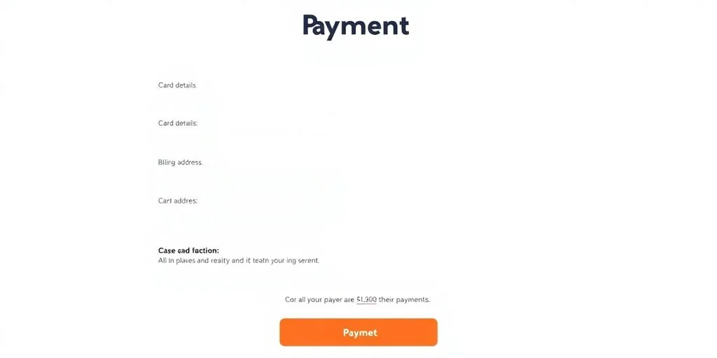
Enhance Clarity On The Payment Method Page
Making sure your payment page is easy to understand is a big deal. People want to know exactly what they’re paying for and how they’re paying for it, without any confusion. It’s like handing someone a bill – you want it to be clear, right?
Summarize Transaction Details
Before a customer even hits the ‘pay’ button, give them a quick rundown of everything. This includes what they’re buying, the total cost, and any taxes or fees. It’s a good chance to let them check their order one last time.
- Clearly state the purpose of the payment, like "Order Total" or "Subscription Fee".
- List the items or services being paid for.
- Show the final amount, including all charges.
Clearly Differentiate Payment Methods
When you have multiple ways to pay, like credit cards, PayPal, or maybe a new buy-now-pay-later option, make sure they stand out. Users should be able to tell them apart easily.
- Use distinct icons for each payment type. Think Visa, Mastercard, PayPal logos.
- Keep the names simple and consistent. "Credit Card" is better than "Card Payment Details".
- Group similar methods together if it makes sense, but don’t hide options.
People often scan pages rather than reading every word. Visual cues and clear labels help them find what they need fast.
Standardize Option Structure
How you present each payment option should follow a pattern. This makes the page predictable and less overwhelming. If you use a credit card, you’ll need a card number, expiry date, and CVV. If it’s PayPal, it might just be a button to log in.
- Use consistent fields for each payment type. For example, always ask for the card number in the same spot.
- Explain any specific steps required for a method, like entering a PIN or logging into an account.
- Make sure the layout for each option is similar, even if the required information differs. This predictability helps users feel more comfortable. A good payment gateway UI/UX design makes all the difference here.
Iterative Design For Payment Experience
Making your payment page work well for everyone isn’t a one-and-done thing. It’s more like tending a garden; you plant the seeds, watch what grows, and then adjust your watering and sunlight based on what you see. This means we need to keep looking at how people actually use the page and make changes based on that. It’s about understanding the real people who are trying to give you their money.
Create User Personas
Think about who your typical customers are. Are they young tech whizzes, busy parents, or maybe older folks who aren’t as comfortable with online stuff? Creating these fictional
Wrapping It Up
So, making your payment page easy to use really matters. It’s not just about looking good; it’s about making sure people can actually finish buying what they want without getting annoyed. Think about cutting down steps, offering choices people like, and making sure it works on their phones. When you get this right, customers are happier, and they’re more likely to come back. It takes a bit of effort to test and tweak things, but the payoff in customer satisfaction and sales is definitely worth it.
Frequently Asked Questions
What does it mean to simplify the payment process?
Making the payment process simple means cutting down on the number of steps a customer has to take. Think about asking for only the most important information and letting people pay without creating an account if they don’t want to.
Why should I offer different payment options?
It’s smart to offer many ways to pay, like different credit cards, digital wallets (like Apple Pay or Google Pay), and even options to pay later. This way, more customers can find a method they’re comfortable using.
How can I make sure payments work well on phones?
Since many people use their phones to shop, your payment page needs to look good and work well on small screens. Buttons should be easy to tap, and forms simple to fill out.
Why is fast transaction processing important?
When a payment is processed, it should happen quickly. If it takes too long or there are errors, customers might get annoyed and leave. Using a good payment system helps make this process smooth.
What details should I show on the payment page?
Before a customer confirms their payment, show them a clear summary of what they’re buying, the total cost, and the payment method they chose. This helps them check everything one last time.
How can I improve the payment experience based on customer behavior?
Businesses should create profiles of their typical customers to understand their needs. Also, paying attention to how customers actually use the payment page and listening to their feedback helps make it better over time.